Visuals matter. Learn the basics of design for nonprofits.
You are already balancing quite a few job roles. Whether it be in nonprofit communications, development, website management, digital strategy—the list goes on. We get it, you’re not exactly excited about adding “designer” to those responsibilities. But let’s face it, especially if you work for a smaller nonprofit, you’ll likely be in charge of putting together branded materials. Beyond that, design is integral to everything you’re doing. Whether it be to get donors, volunteers or grow general awareness, aesthetics go hand in hand with all your work you do.
We’re not telling you to go back to design school, but we are going to point out a few web design basics that could help you take your nonprofit work to the next level.
These come from Mark Hemeon, the CEO & Founder of Design Inc. His post goes into more depth, but this is what we think you should know.
4 basic rules of graphic design for nonprofits to know
1. Prioritize your message.
Well duh. This seems like a no-brainer. But we sometimes forget it. As we build out web pages or communications materials, we try to fit so much on the page (as we have a lot to say) that we sometimes forget our overall goals. Once you’ve finished building out content, always take a step back and look at it as if you’ve never seen it before. What’s the first thing you notice? Is the message what you want it to be?
Acumen immediately pulls out their mission statement in a creative way. They also draw your attention to their primary goal with the “donate” CTA. This prioritization carries through the rest of the homepage as your eyes flow to the most important pieces.

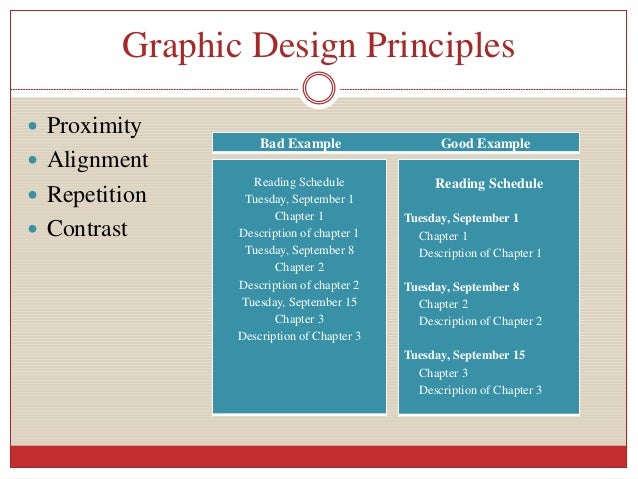
2. Alignment matters.
If something looks off about a piece you’ve created, it may be as simple as checking the alignment. Be sure to keep it left, right or centrally aligned. Take a look below to understand how much this can impact how you process text:
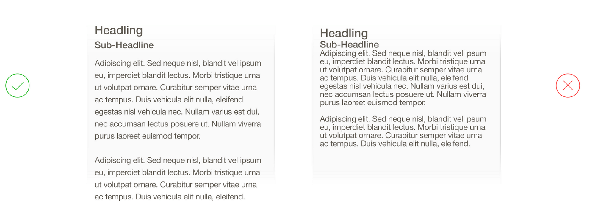
3. Text needs space.
One of the worst moves you can make when laying out type is cramming it all together. Readers will not want to know your nonprofit’s mission statement if it hurts their eyes to take in. If you’re unsure, leave more space than you think you need.
4. Color communicates.
A few important notes about color: stick to your brand and don’t forget about legibility.
It’s tempting to go crazy with color, but most of the time, you should stick to your brand guidelines for consistency’s sake. You should also be wary of using it with text. It can get hard to read and look unprofessional.
Ready to design like a pro? Well, luckily you don’t have to be. Use tools like Canva or get in touch with an agency to either get feedback or purchase a few templates that could be recycled.
If you need help with your designs, contact us at ArcStone. We do a lot of web design and graphic design work with nonprofits and love to make an impact.