Donate Now – The Workings of a Successful Nonprofit Call To Action
Chances are, your nonprofit has its own emotional and engaging story that causes people to donate. Chances are, you can create a quality call to action that gets people to take that step.
What is it that makes some nonprofit’s call to action cause us to click off the page while others fill us with inspiration and lead us to take action? We analyzed a few nonprofit call to action landing pages to better understand what they’re doing right.

I don’t know about you, but upon seeing the smiling face of this child, I feel excited to learn more about how Water for People helps others like this. Why?
– The “donate now” text makes it clear how to take action, but it is not too in-your-face since it is off to the side and is in a nice faded text.
– Their caption goes on to explain that, by donating, you are doing more than just giving your money away once – you are investing in the future and helping them get closer to “complete water coverage” for everyone.
– They were thoughtful about their overall use of color, especially with the orange CTA matching the child’s dress.

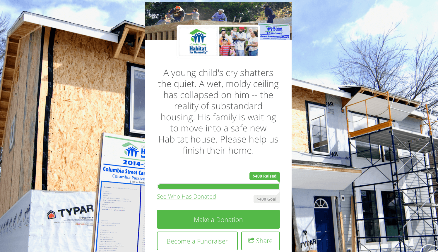
The layout of this page draws you in to read the central text. How?
– By interrupting the page with the text, your eyes go from trying to make sense of the background to reading about it in the central column.
– There’s really no headline that summarizes this page which might also encourage the viewer to read through the entire caption.
– Once the viewer starts reading, it’s hard to stop as the text describes how a child suffers if there aren’t these donations.
– By showing numbers in the bar above the CTA, the potential donor can see how their contribution could work towards the goal.
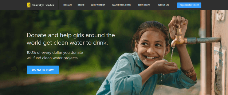
Again, the smile on this girl’s face leaves the viewer feeling hopeful – you want to be a part of making this possible.
-charity:water does a great job of moving your eye towards the donate now option – the girl’s gaze points you right to it.
– Emphasizing who it is that is benefiting from this cause and even showing the action they are able to take because of a donation increases the page’s effectiveness.
– The blurred out background behind the CTA and color choices make the CTA page aesthetically pleasing and easy to take in.
From the examples above, we can see that there are some commonalities that make for strong CTA’s:
1. Keep the landing page clear of distractions. Once viewers have come here, you want their next step to be a simple choice; they should see that the best option is to click through wit the CTA button. After they’ve clicked through and taken action is when you should bring them to another landing page that thanks them for their donation and guides them to other site options.
2. Show the effect your nonprofit’s cause has on real people. When you demonstrate proof of former donations’ affect on those in need, the viewer will be more likely to trust that their funds can really help others.
3. Be specific. State what exactly a donation will contribute to – even indicating exact amounts that lead to a certain benefit to others can help the donor make their choice.
4. Keep it manageable. Breaking down donations into smaller amounts can help the viewer digest the amount they can contribute. Seeing that smaller amounts are also okay can make the viewer feel better about their contribution.
5. Make it look nice! The landing page is just as important as an attractive home page. If it looks over-crowded or too technical, there’s less of a chance that your viewer will want to stay on it to read through your information.
Also read about Facebook’s Donate Now Feature they’ve recently added to make donating easier on your nonprofit Facebook page. For more on the overall landing page layout, read Updates to Landing Pages Make Viewers 2-3X More Likely to Convert and How to Design a Great Landing Page.